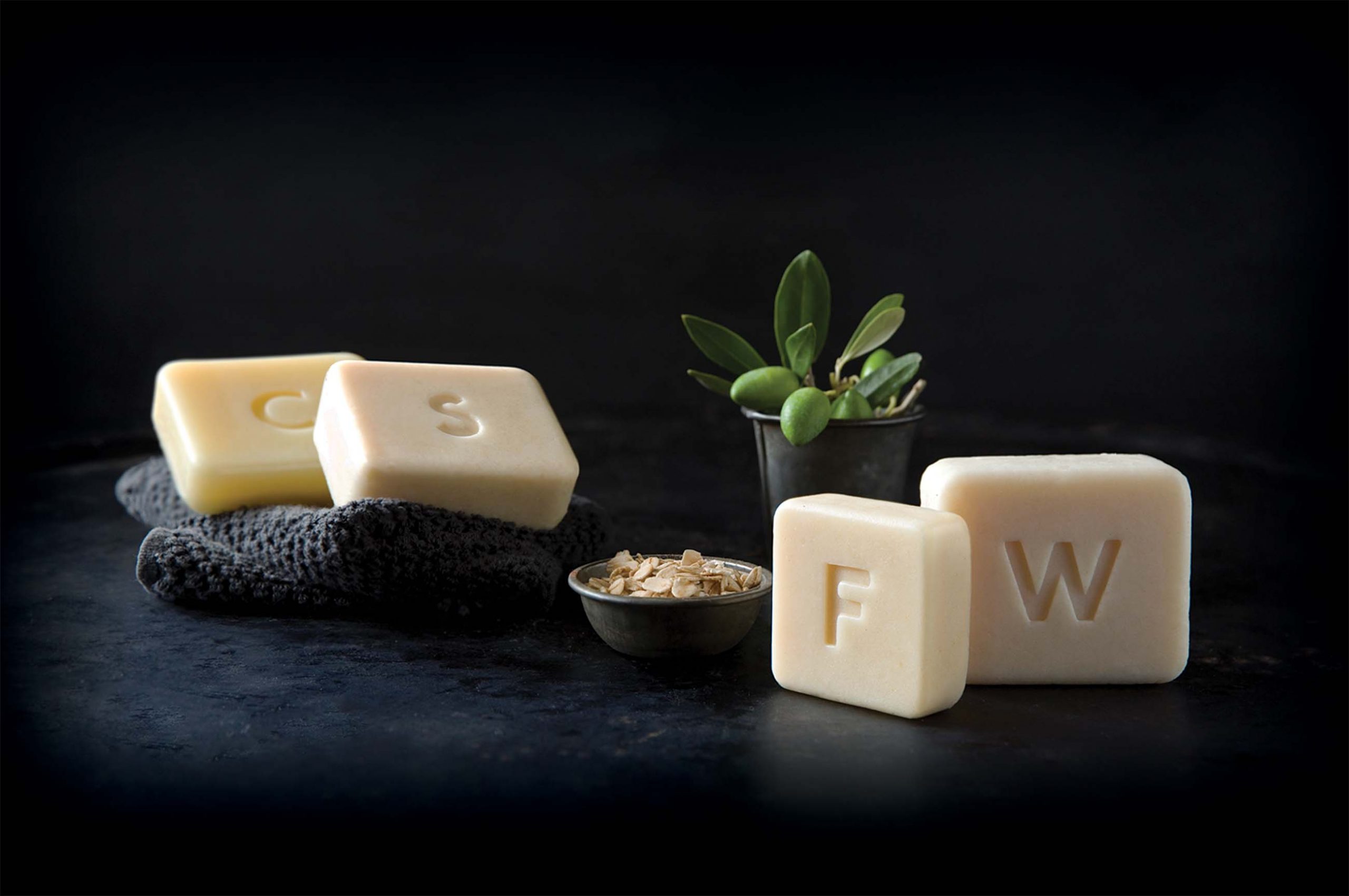
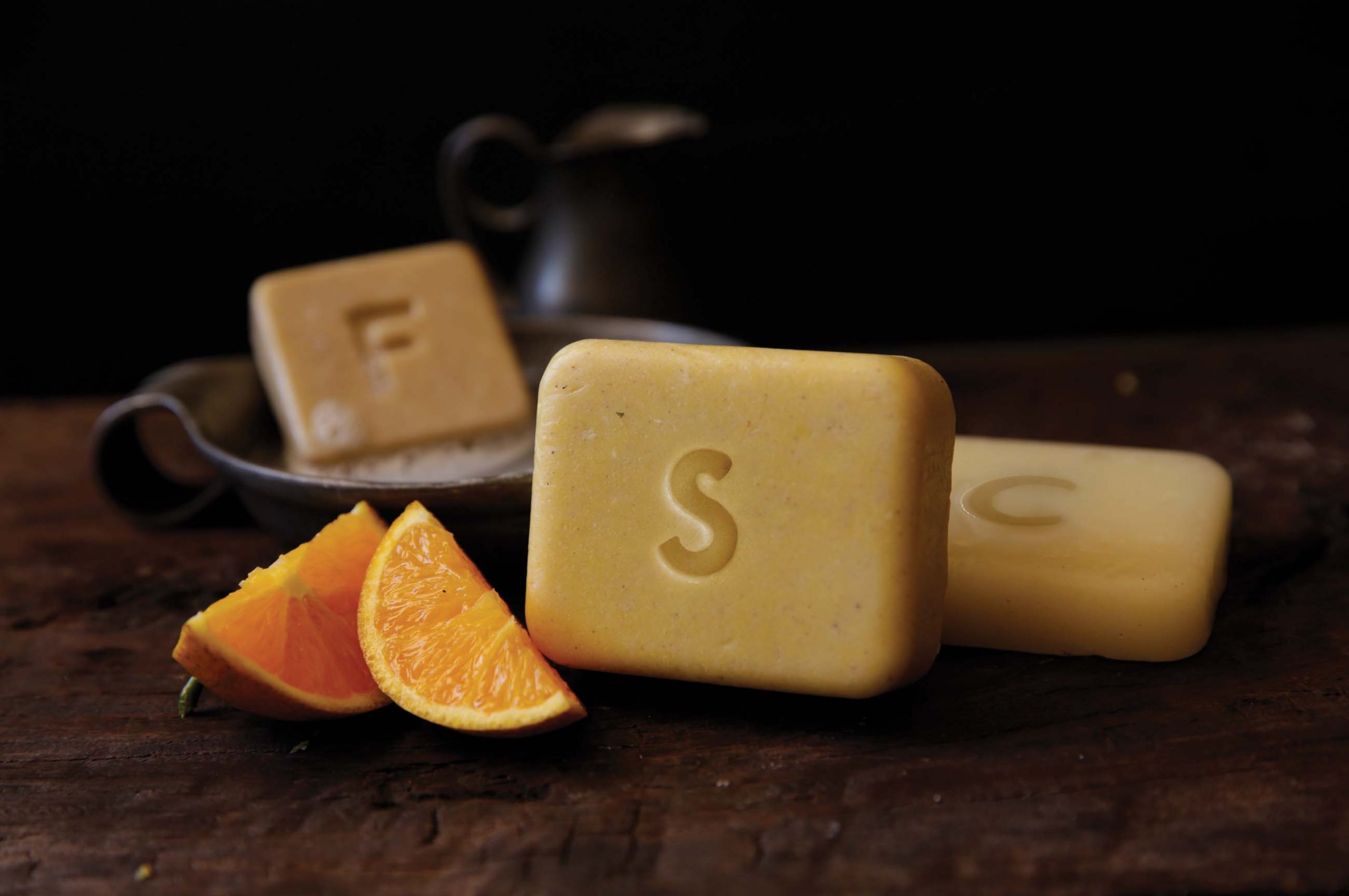
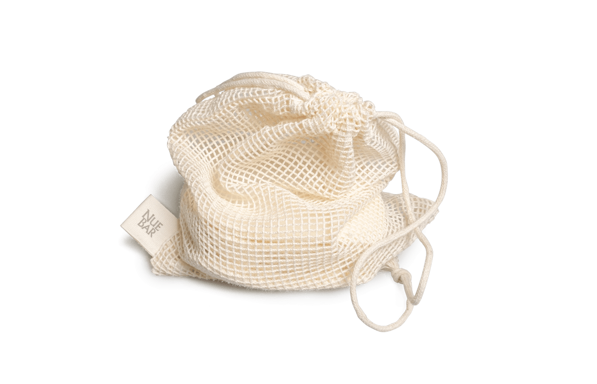
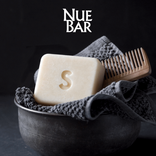
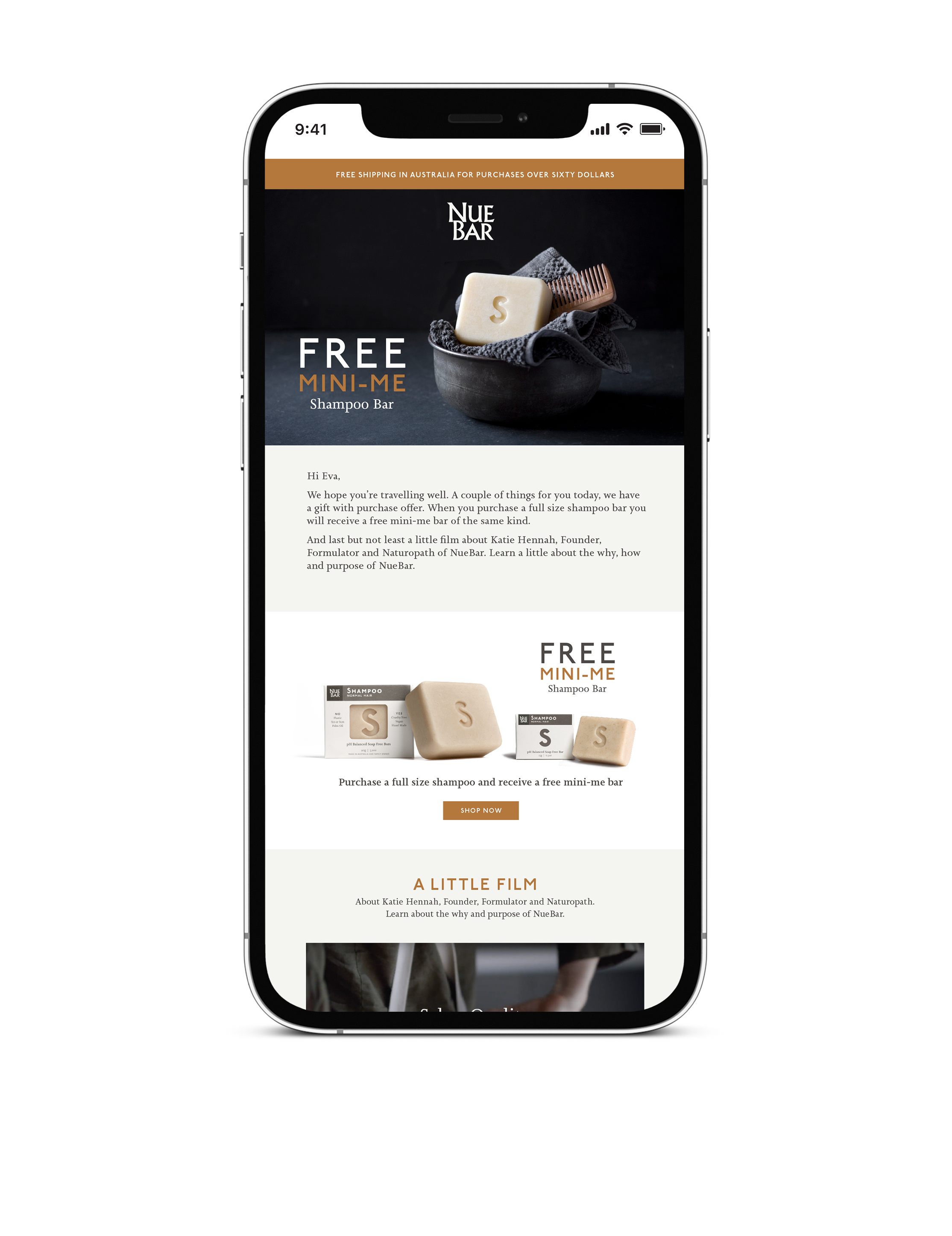
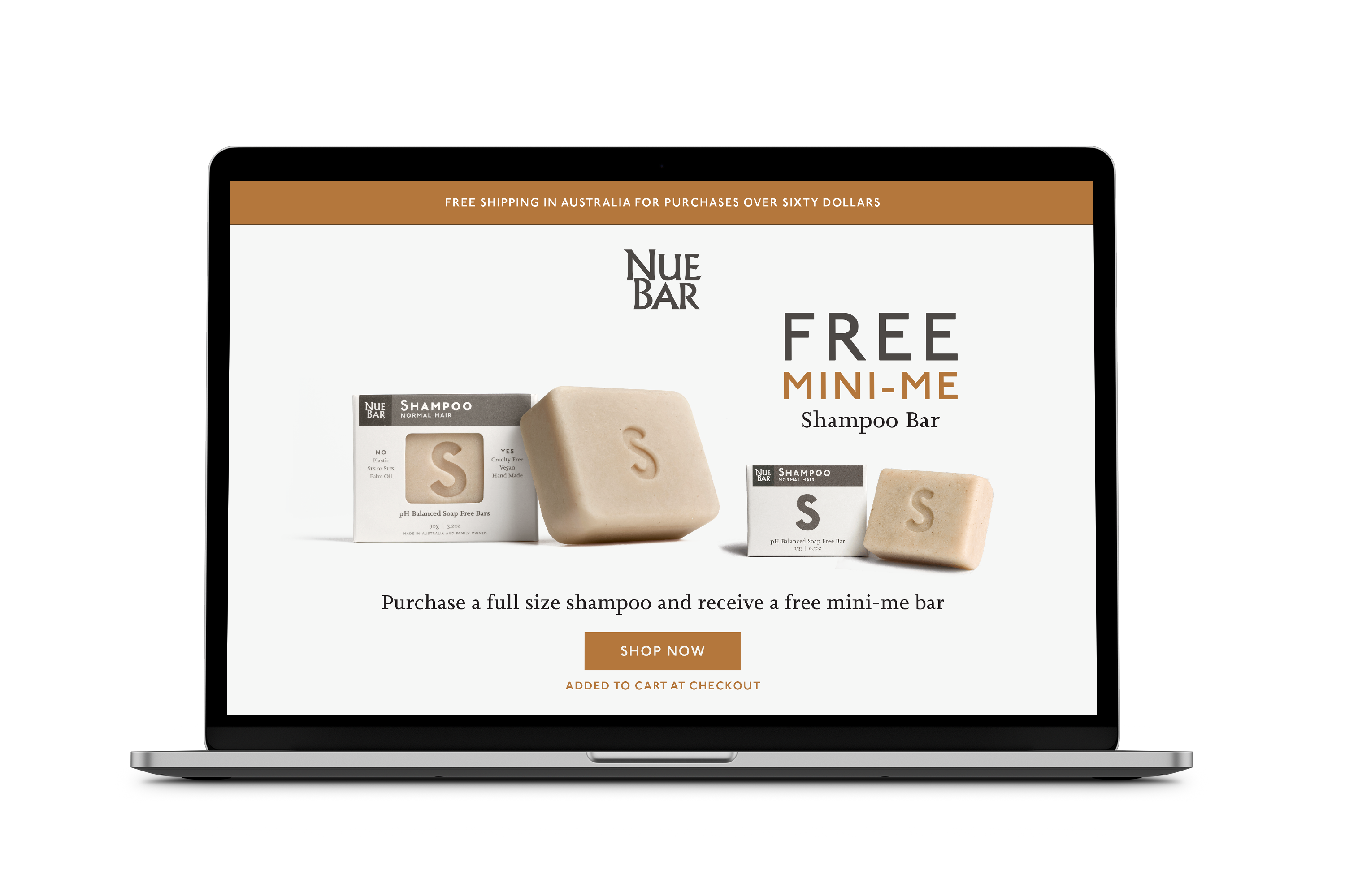
An eco-luxe start-up of solid personal care bars, formulated by a Naturopath and made by hand in Sydney. Game on. We took our inspiration for the brand from Aesop, our photography direction harking back to a simpler more pure life, without plastic bottles. The key messaging is that you don’t have to compromise on quality to be plastic free. 
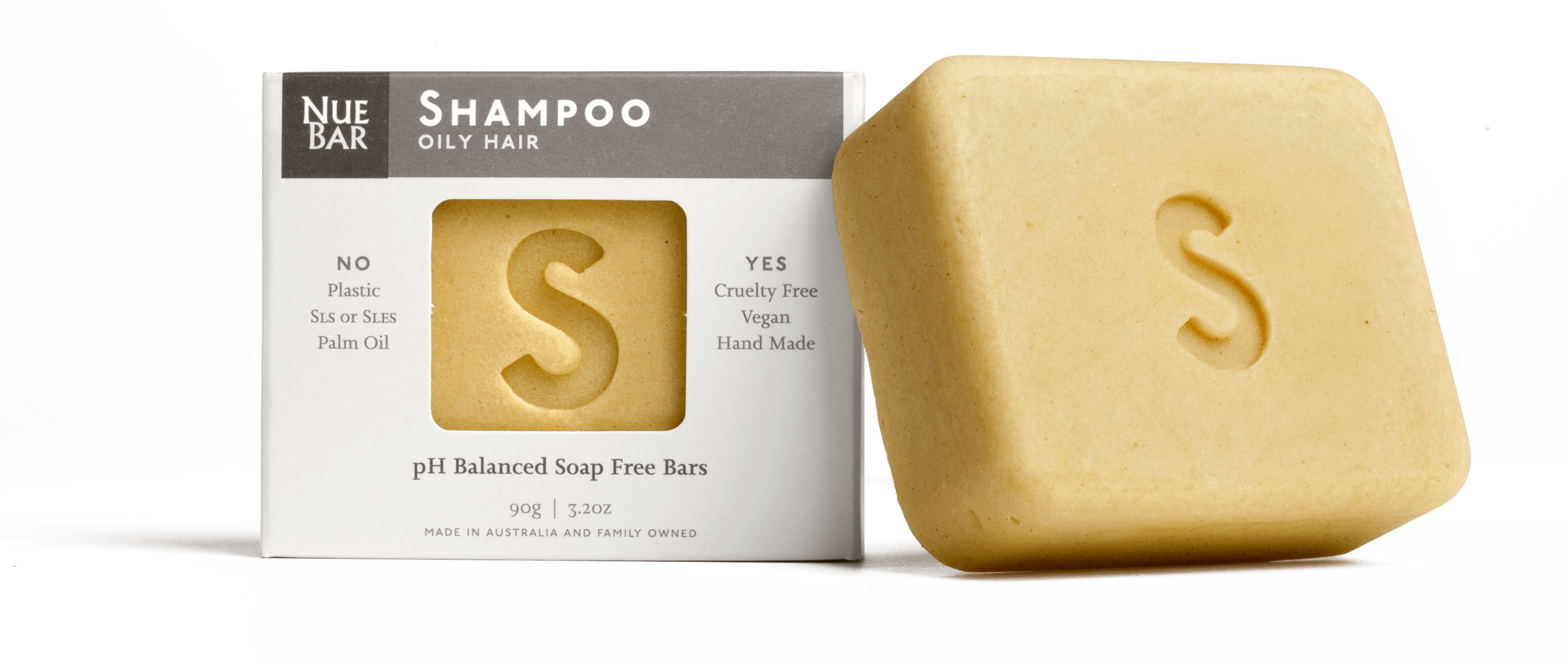
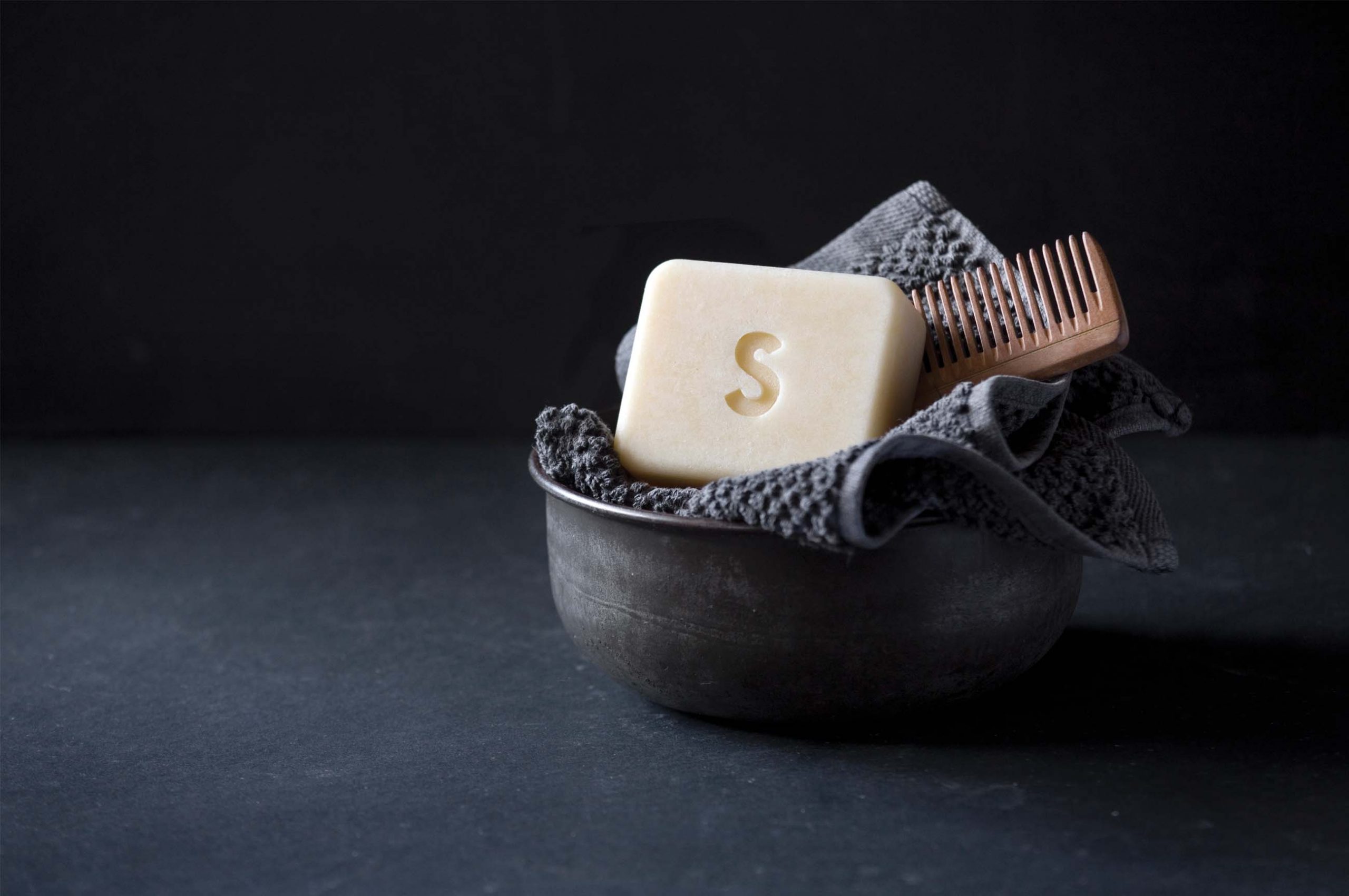
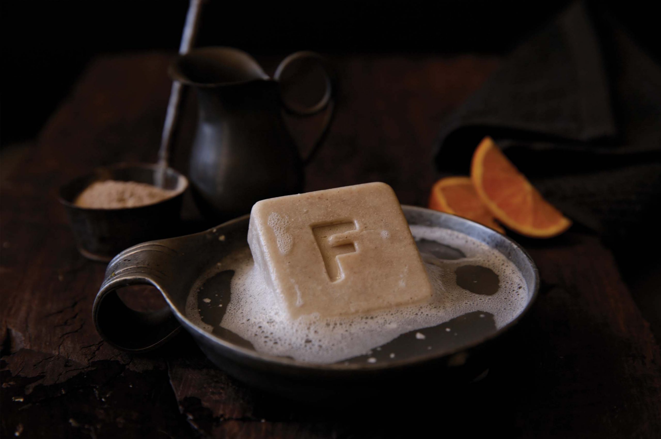
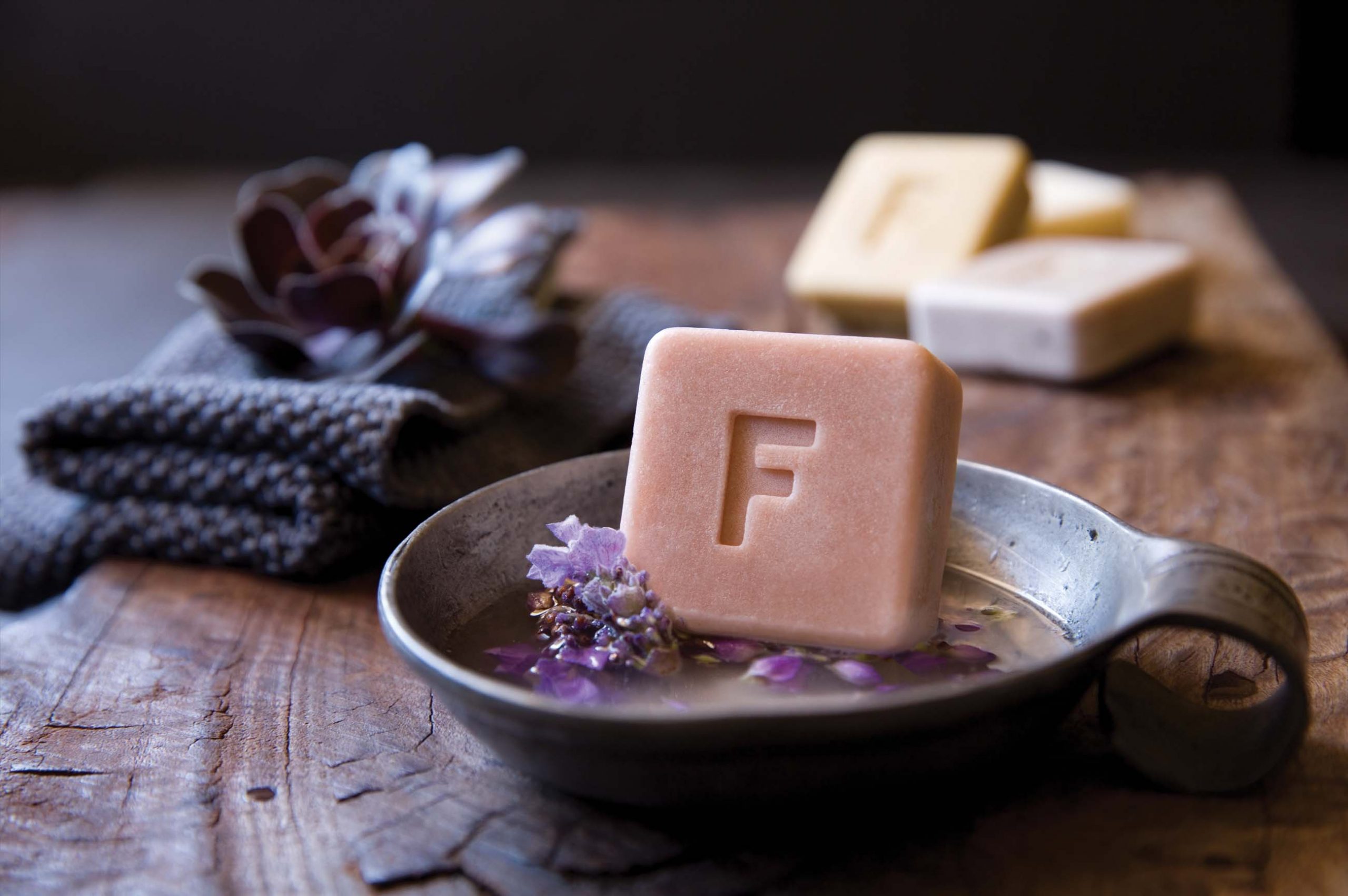
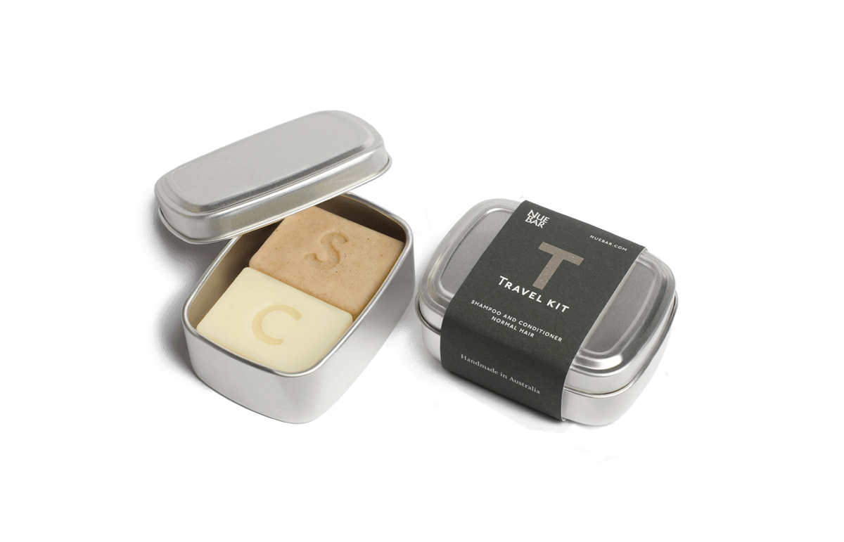
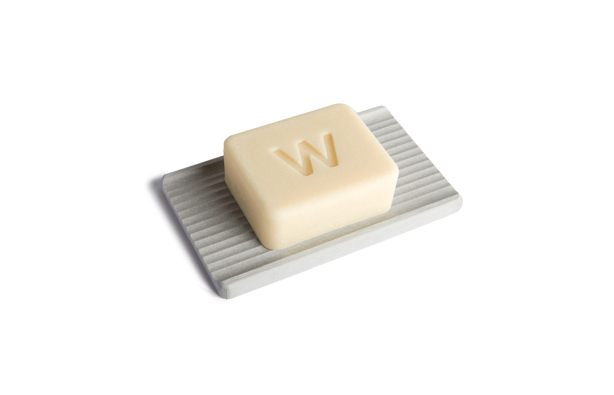
We were involved at the product development stage and recommended stamping letters into the bars. Why? Competitors brands, once out the packaging could be for any brand, and how could you tell what was a shampoo or a body wash. The letters set Nuebar apart and are practical, S = Shampoo, C = Conditioner, F = Facewash? Check it out, NueBar.com
NUEBAR LOGO
Modern naturopathy originated in Germany and as a naturopathic based brand I chose Albertus
for the logo ‘NueBar’ Albertus was designed by German born type designer and lettercarver Berthold Wolpe in 1932. Albertus is a stunning example of handmade, crafted artisanal letter forms, the perfect match for NueBar.
TEXT
Joanna is a serif typeface designed by Eric Gill (1882–1940) in 1931, was named for one of his daughters. Gill chose Joanna for setting An Essay on Typography, a book by Gill on his thoughts on typography, typesetting and page design.[1] He described it as "a book face free from all fancy business
HEADLINE & LETTERS IN THE BARS
With a range of bars for varying applications (shampoo, conditioner, face wash) Nuebar needed a way to
distinguish what went where.
So why not extend a typographical system to the bars themselves, a great solution to making plastic-free, easy.
MY BLOG
https://nuebar.com/blogs/nuebar/s-is-for-shampoo